 The ubiquitous peace symbol turns 50 years old this year. In this excerpt from the new, lavishly illustrated book Peace: 50 Years of Protest, Barry Miles describes the origin of the symbol in the anti-nuclear politics in England in the 1950s.
While the Campaign for Nuclear Disarmament (CND) was being set up, another organization had been making plans for action. The Direct Action Committee against Nuclear War (DAC), which had sent Harold Steele to Tokyo, bound for the Pacific, met in November 1957 to discuss its next move. Hugh Brock, the editor of Peace News who had organized the first demonstration at Aldermaston back in 1952, suggested the DAC arrange a four-day march to the atomic weapons factory for Easter 1958. The members of the DAC were mostly from an anarchist-pacifist background and, like Brock, were influenced by Mahatma Gandhi’s pacifist fight for Indian independence.
They were determined to use his nonviolent principles in their own campaign to rid Britain and the world of nuclear weapons. Their intention was to tackle the problem head-on: to bypass the politicians and engage the attention of workers at the Atomic Weapons Research Establishment (AWRE) directly, to try to convince them to stop working on weapons of mass destruction. However, unlike the 1952 demonstration, this one would be preceded by a march that they hoped would focus attention on the issue so that people at Aldermaston would be ready for the debate when the DAC marchers arrived.
An ad hoc Aldermaston march committee was set up, comprising Member of Parliament Frank Allaun, Hugh Brock from Peace News, Walter Wolfgang, organizer of the Labour Party’s H-Bomb Campaign Committee, and Michael Randle, in charge of promoting Peace News. Meetings were held every week or so in the House of Commons, in a committee room that Frank Allaun would book for them. There, surrounded by heraldic wallpaper and Victorian paneling, they debated how to change policies made in similar rooms in the same building.
The CND had only existed a few days and had not yet held its first public meeting, so DAC was cautious when asked if they wanted to be involved with the march. The members agreed to give their blessing to the march . . . “but should make it clear at this stage of the Campaign that they could not be very closely involved.” The DAC march committee had originally envisioned about 50 or 60 people walking all 53 miles from London to Aldermaston, but with the launch of CND and all the attendant publicity, it now seemed that many more people would be coming. Many members of the Labour Party were sympathetic and intended to march, including members of parliament; a number of labor unions intended to march, bringing with them their magnificent banners.
The Universities and Left Review club, people involved with the forerunner of the New Left Review, formed a contingent, as did the Victory for Socialism group. The Quakers were the largest religious group planning to march from the beginning, but many other Christian organizations soon became involved. The march committee realized that things had changed, and several hundred people could be expected to attend.
Banners Against the Bomb
This changed the nature of the demonstration, making a change of policy necessary: The original idea of calling upon the staff at Aldermaston to stop working there was now overshadowed by the potential size of the march. The committee was divided, with Hugh Brock and Michael Randle remaining in favor of addressing the workers, and Frank Allaun and Walter Wolfgang now opposed to the idea. In a compromise the march was followed by a nine-week picket of the Aldermaston bomb factory, during which the workers were asked to withdraw their labor.
Given the enlarged size of the march, the issue of banners became of prime importance. The whole point, after all, was to express their views with leaflets and conversations; banners and slogans were a key part of the mix if they wanted people to know all the players as they marched through the streets.
Gerald Holtom
![]()
![]()
Iraq War protest, copyright 2008 Essential Works Limited
A member of the Direct Action Committee’s Twickenham branch, textile designer Gerald Holtom was involved in the planning of the march from the beginning. Because he ran his own graphic design studio, he was given the role of designing the banners and placards to be carried to Aldermaston. Holtom was a committed Christian and pacifist: he was tall and soft-spoken. He graduated from the Royal College of Art in 1935. His deeply felt pacifism led him to spend World War II working on a farm in Norfolk as a conscientious objector. Holtom took his responsibility for getting the peace message across seriously. He wanted to create a design style that was not only informative but also one that summed up the message – something that these days might be called a “brand.”
Holtom was best known for appliqué work rather than graphic art. He made the striking covering for the east wall of Sir Basil Spence’s 1957 St. Oswald’s Church in Tile Hill, Coventry, but his most famous work was the appliqué altar cloths and sequence of acoustic panels on the west end of St. Paul’s Church, Lorrimore Square in south London, built in 1959-1960 to replace a Victorian church bombed during the war.
The U.S. religious right later tried to suggest that whoever designed the peace symbol must have been a devil-worshipping communist, but Gerald Holtom was as far from this stereotype as humanly possible. He was part of a quiet, pacifist element in the Church of England active after the war, helping rebuild the churches they saw as a focal point for communities, destroyed by the bombs. Many of those seeking to discredit the symbol thought that Bertrand Russell, noted for his left-leaning atheism, had designed it. Which was also fiction.
Prototype
Toward the end of February 1958, Gerald Holtom arrived at the offices of Peace News, where the actual planning of the march was taking place. The practical organizing was done by Hugh Brock and Michael Randle, from the March Committee, who were both on the staff of Peace News; Gene Sharp, a Peace News staff member, largely responsible for the Briefing Leaflet for the march; and Pat Arrowsmith. It was Randle, Brock, and Arrowsmith who met Gerald Holtom to review his sketches. Under his arms Holtom carried two large rolls of heavy brown paper. One roll contained drawings of designs for banners for the march: checkered flags, semaphore code flags, and Christian flags with crosses as well as a curious symbol that no one had seen before that he was proposing to represent the antinuclear campaign. He had drawn a line of marchers carrying these flags to show how the designs would look in use.
On the other roll of paper, he had made more detailed sketches of this new insignia he thought might be useful as a symbol for the march and the nuclear disarmament campaign. He had recognized early on that the biggest design difficulty was finding a shorthand way of expressing the lengthy slogan “Unilateral Nuclear Disarmament.” His solution was a circle, and within it the now familiar symbol, a cross whose horizontal arms had slipped 45 degrees downward.
He explained to his small audience that the symbol was made up of the British navy semaphore letters for N and D. This semaphore system used two handheld flags to spell out messages from one ship to another, provided the signalmen were within telescope range. One flag held vertically and the other pointing directly down signified D, while two flags at 45 degrees from horizontal was N. The symbol embodied an encoded message calling for Nuclear Disarmament. He showed them versions in brown ink, with the circle superimposed on a brown square, and a version in purple ink. According to one report, the committee was initially dubious, but his arguments quickly won them over, and with only slight hesitation they decided to formally adopt the symbol and asked him to work on some preliminary designs.
Michael Randle, however, remembers their support for the symbol as being immediately positive. “I recall particularly the day when a Twickenham artist, Gerald Holtom, arranged to see Hugh Brock, Pat Arrowsmith, and myself in the small Peace News offices in Blackstock Road, and showed us the enigmatic symbol he had designed and which he urged us to adopt,” Randle wrote in Campaigns for Peace. “He also brought sketches of how he envisaged the march, with long banners stretching across the road with his symbol at either end of it, and such was his enthusiasm and persuasiveness that we immediately agreed to his proposal. This was how the now famous nuclear disarmament symbol came to be adopted: Holtom himself remembered them being totally encouraging. In a letter to Hugh Brock in September 29, 1973, he said, “Without you, Michael Randle and Pat, there would have been no symbol.”
Doubts
However, Holtom still had his own doubts about it. In the same letter to Brock, he wrote: “The day after your unequivocal approval of the symbol. I made a badge the size of a sixpence in paper, black ink on white, pinned it on my lapel with some trepidation in fear of ridicule and forgot it.” Later that day, while visiting the local post office, a young woman behind the counter asked him about the badge he was wearing. He explained it was new and it called for nuclear disarmament. He later wrote that as he returned home, he was “filled with embarrassment and doubts.” Michael Randle wrote, “I think what enthused us was not so much the explanation of the genesis of the symbol, as the vision in his sketches of how the march might look if we adopted it.”
A week later Holtom arrived at the first meeting of what was to become the London Region CND, held in the small hall of St. Pancras Town Hall. He brought with him some of the long banners he had devised for the upcoming march.

Peace banner, copyright 2008 Essential Works Limited
At the back of the hall, he unrolled a bolt of black cloth about 6 yards (5 m) long, designed to be carried sideways on the march so people could read them as they walked past, like an advert on the side of a bus. This provided another solution to conveying a lengthy slogan to the public. He fixed bamboo poles to each end and asked two people to hold them up. Written on the black cloth were the words “Nuclear Disarmament” in white paint, and at each end was his curious new symbol, also in white. The results were striking. He explained to the meeting that it was the semaphore for the initials ND, Nuclear Disarmament, but that the broken cross could also mean the death of man, whereas the circle symbolized the unborn child. In combination it represented the terrible threat nuclear weapons posed to humanity, including the unborn.
This explanation of the symbolism comes from Rudoph Koch’s The Book of Signs, which is almost certainly where Holtom got his inspiration. Koch’s book, which contains almost 500 symbols from medieval Europe, was first published in Britain in 1930, but it was issued as a cheap paperback by Dover Publications in 1955 and became popular among art students at that time. As the director of a design studio, it is unlikely that Holtom did not have a copy. His explanation of the symbol for a dead man and the symbol for an unborn child match those of Koch precisely. The London Region CND was enthusiastic about his designs; they liked the stark black and white, which was easy to reproduce, and said they would like to use these designs on the march. They could not speak for CND itself.
Other Symbols
The symbol was more than just a design problem to Holtom; he believed passionately in the campaign and had thought long and deeply about a symbol to represent it. Years later, in 1973, Holtom wrote to Hugh Brock, telling him of his state of mind at the time and explaining in greater detail the personal symbolism involved in his creation of the logo. For him it was not simply another design job — in fact, the intensity of his feelings on the subject may be what inspired him to the rarest of creations: a new symbol that would resonate across nations and generations, gathering meaning, until it became part of the human visual vocabulary.
At first he had thought of using the Christian cross as the dominant motif, but he told Brock that he realized “in Eastern eyes the Christian Cross was synonymous with crusading tyranny culminating in Belsen and Hiroshima and the manufacture and testing of the H-bomb.” At the time, he had spoken with various priests about the idea, and they were not happy with using the cross on a protest march. He also rejected the image of the dove, then used extensively by the peace movement — in particular the one drawn for them by Picasso — as it had been appropriated by “the Stalin regime . . . to bless and legitimize their H-bomb manufacture.”
Holtom told Brock that on February 21, 1958, the day he designed the symbol, he was in despair. Deep despair. “I drew myself: the representative of an individual in despair, with hands palm outstretched outward and downward in the manner of Goya’s peasant before the firing squad in his painting, The Third of May 1808. I formalized the drawing into a line and put a circle around it . . . It was ridiculous at first and such a puny thing . . . ”
In fact, Holtom may have been thinking of a different Goya. In The Third of May 1808 the man before the firing squad has his hands raised high in the air, albeit in the same V position. However, one of the most famous images from Goya’s Disasters of War series of 80 etchings is one of a peasant on his knees, slumped in depression, with his hands in exactly the position Holtom describes.
Dissatisfaction
Holtom was not happy with his design: In many ways he was asking too much of himself. Everybody believed nuclear disarmament was desirable. He felt that it was not enough just to call for nuclear disarmament. He wanted a symbol that conveyed the need for individuals to take responsibility for the direct creative action that was necessary in order to combat the nuclear threat. As he saw it, the key to nuclear disarmament was unilateral action.
Holtom returned to his studio in Twickenham, fresh from meeting with Brock and the others at Peace News, and put his staff to work, silkscreening lollipop signs and banners, all bearing his new design. Five hundred cardboard lollipop signs on sticks were made: half of them were black on white and half white on green. Holtom was a committed Christian, and as the Church’s liturgical colors change over Easter “from Winter to Spring, from Death to Life” he used the same symbolism for the banners.
The black-and-white lollipops were to be carried on Good Friday and Saturday, whereas on Easter Sunday and Monday the green-and-white ones were distributed. His design called for thin arms on the cross culminating in a serif where they met the enclosing circle. Many variations on this theme have been tried over the years, but this design remains the most elegant. Holtom still felt his design didn’t say enough.
A “Revolution of Thought”
Nonetheless, he turned his energies to making the banners and lollipop signs for the march. A few days later, in his workshop, he experienced a “revolution of thought.” He told Brock in his letter that he had been holding the symbol in his hand, turning it around, staring at it “in the struggle to find a way beyond despair:” It was then that it suddenly occurred to him that if the symbol was inverted, then it could be seen as representing the tree of life, the tree on which Jesus Christ had been crucified, and that, for Christians like Gerald Holtom, was a symbol of hope and resurrection.
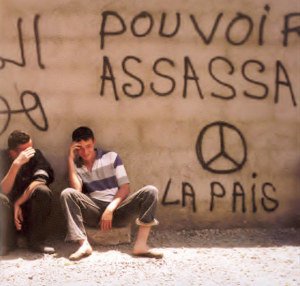
Graffiti, copyright 2008 Essential Works Limited
Even better, the inverted image of a figure with arms stretched upward and outward was the semaphore signal for U: unilateral. And so for Holtom the symbol took on an even more symbolic meaning. Just as the American religious right later claimed the design to be an inverted cross, Holtom inverted the design to become a symbol of hope.
Holtom also made the lead banners for the march, the biggest of which read: “March from London to Aldermaston” in the striking white letters on a black background, flanked by the peace symbol. The banner was used every year, though the lettering was changed to read “March to London from Aldermaston” after the first year. Each year it was brought out, cleaned up, and a fresh bunch of daffodils attached to it as a symbol of spring and life. Its stark black-and-white design was modern-looking at the time and provided a template for antinuclear posters and banners in Britain for years to come.
The Ban-the-Bomb Button
The march also needed button badges, both for the marchers and to distribute and sell. Using Gerald Holtom’s design, Eric Austin of Kensington CND stamped them from clay and fired them in a kiln. They were white, with the circle and cross in black, and were distributed with a note pointing out that these ceramic badges would be one of the few human artifacts likely to withstand a nuclear attack unless they received a direct nuclear hit — the only evidence that a living person had once stood where it was found, Austin echoed Haltom’s reference to Rudolph Koch’s The Book of Signs by stating that the symbol had several layers of meaning embodied in it: both the semaphore for N and D and also the traditional symbols of life and death. “The gesture of despair had long been associated with the death of man and the circle with the unborn child,” he said.
After the original ceramic badges, which have now become collectors’ items, the Campaign made a large batch in plastic before settling on a cheap mass-produced tin button, with the symbol in white on black, which became the standard design. The design was distinctive, easy to draw and graffiti. But there were still doubters, as Michael Randle later wrote, recalling when the first pamphlet was printed bearing the symbol.
A veteran peace activist complained to Randle that he and the others on the committee must have been out of their minds in adopting it. Randle reports his friend saying, “What on Earth were you, Hugh, and Pat thinking about when you adopted that symbol? It doesn’t mean a thing and it will never catch on.” As Randle points out, had the march not been a success, his friend would probably have been proved right.